
Knowledge base
June 21, 2023
Bookmarks in Power BI: Interactive reports and improved user experience
In Power BI, you can use bookmarks to capture and save the current state of a report, including filters, slicers, visuals and other settings. These bookmarks can be used to create interactive experiences and switch between different report views or scenarios. Here’s how to use bookmarks in Power BI.
Creating bookmarks
To create bookmarks in Power BI Desktop, go to the View tab and click the “Bookmarks panel” button to open the Bookmarks panel. With the desired report view displayed, click “Add” in the bookmarks panel to create a new bookmark. Give the bookmark a descriptive name.
Customize bookmark settings
With a bookmark selected, you can choose the settings you want to capture. This includes the state of filters, slicers, visibility of visuals, drill-through settings and other report elements. Enable or disable the options based on what you want to include in the bookmark.
Header 4: Apply bookmarks
After you create bookmarks, you can apply them by selecting a bookmark from the Bookmarks panel. This restores the saved status of the report, including selected filters, slicers and other settings. The visuals will be updated accordingly.
Header 5: Using bookmarks for interactivity
Bookmarks can be used to create interactive experiences for your report users. For example, you can create a table of contents or navigation buttons using bookmarks. Each bookmark can represent a different report view or scenario, allowing users to switch between these reports with a single click.
Header 6: Button visualization
To make it more intuitive for users, you can add buttons or images to your report and assign bookmark actions to them. The visuals “Button” or “Shape” in Power BI can be used for this purpose. You can configure the visuals to activate the corresponding bookmark when clicked.
Bookmarks provide a way to improve interactivity and user experience in your Power BI reports by saving and restoring specific report states. This allows users to navigate and explore the data in a more structured and controlled manner.
By clicking on the buttons, we can easily switch between different views of the dashboard. As shown in the image below, we can click on the “Cheapest” or “Most Expensive” visualizations to switch to the corresponding view using bookmarks.
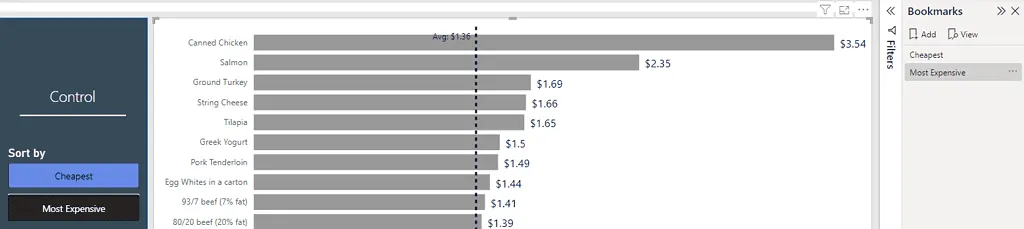
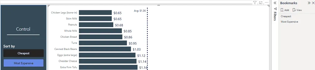
Source: thedataschool
Want to know more?

Related
blogs


Tech Updates: Microsoft 365, Azure, Cybersecurity & AI – Weekly in Your Mailbox.