Knowledge base
February 05, 2022
Gmail gets a new user interface similar to Microsoft Outlook
Up front, Google’s Gmail has only received minor updates in recent years. That will soon change, however, as the company has now announced a new unified user interface that makes it easier to switch between applications.
As a reminder, here’s what the current interface looks like:
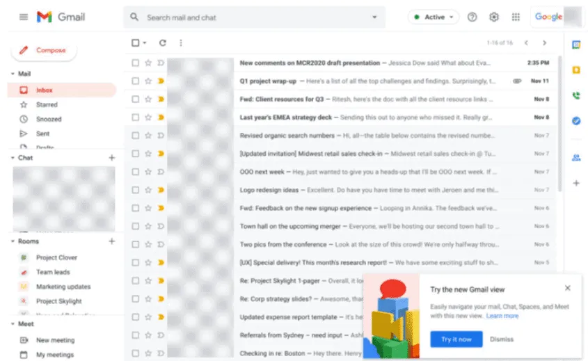
As you can see in the screenshot above, users are prompted to optionally try a new user experience for Gmail. Once they log in, this is the interface they get:
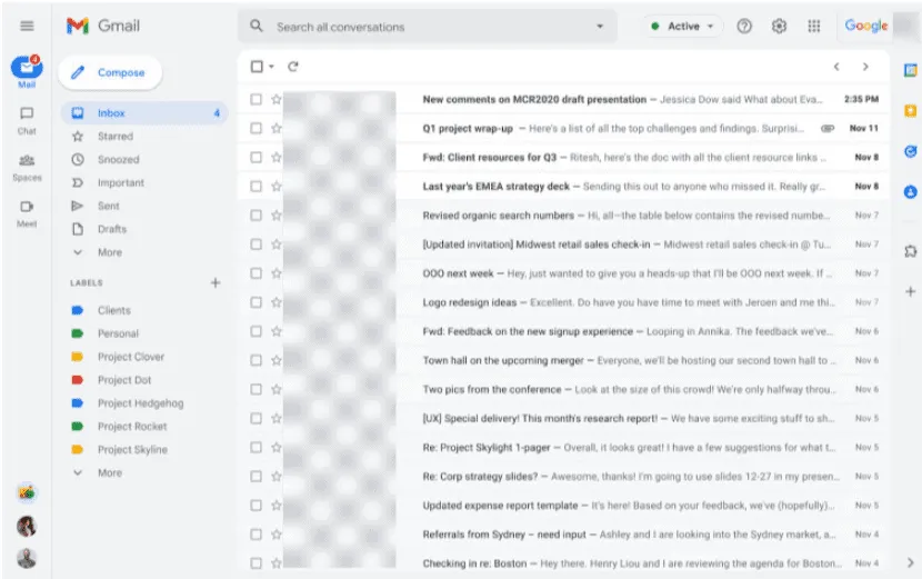
At first glance, it somewhat resembles Microsoft’s Outlook, although there are some differences. Applications are neatly tucked away in the left pane, while options for labels and emails are now fully displayed next to it as well. Since the applications are in their new position, you don’t have to switch between tabs or windows to use Chat or Meets, you can do that directly in the same browser window. Notification balloons are also displayed for each application. In the future, Google will also provide a unified search experience so that it also displays results from integrated applications such as Chat.
The new interface is rolling out to everyone except Workspace Essentials customers and administrators cannot disable it. From February 8, users will see the opt-in banner, while from April, even those who have not opted in will get the new UI with the option to revert to the classic interface.
By the end of Q2 2022, this will become the default UI for everyone and cannot be rolled back. A streamlined navigation experience will also be available on dedicated chat on the web, and users will not be able to move chat windows to the right side of Gmail.
Source: neowin
Want to know more?
Related
blogs
Tech Updates: Microsoft 365, Azure, Cybersecurity & AI – Weekly in Your Mailbox.
