Knowledge base
April 23, 2022
Outlook tasks versus Microsoft to do: which is better?
Microsoft Outlook and Microsoft To Do are two of the best free task managers available. But which one is better overall? Find out here!
Microsoft has two task management apps. Microsoft To Do is preinstalled on Windows computers and is also available online. The email and calendar client, Outlook, also includes a robust tasks feature.
But which is better for managing your task list? The competition is closer than you might think. This article compares Microsoft To Do and Microsoft Outlook as task management apps to find out which is the better choice.
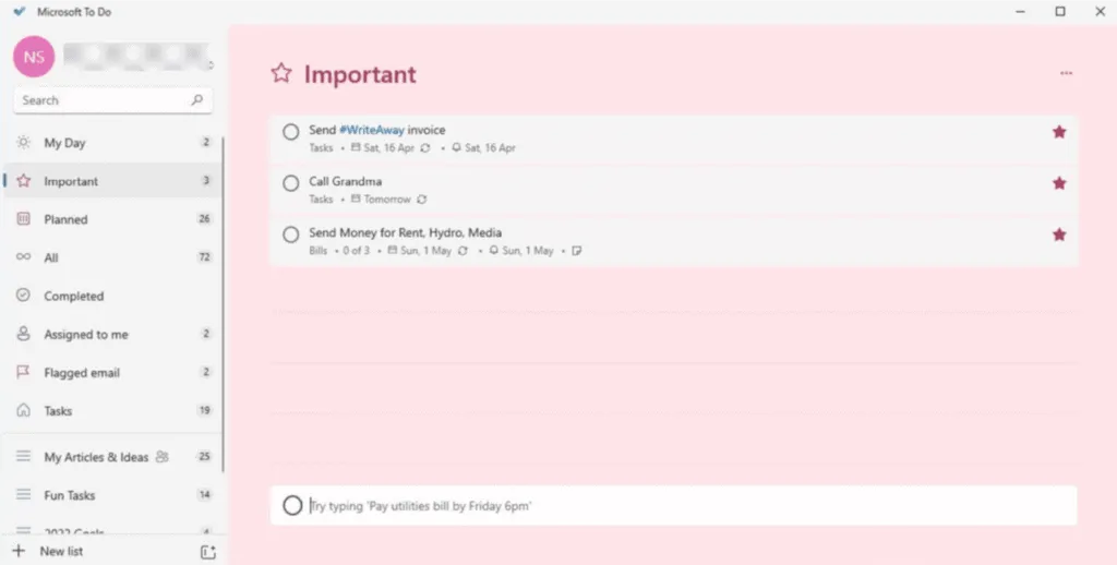
To Do, which used to be Wunderlist, is a free app that comes with Windows 10 and 11. You can also open Microsoft To Do in your browser. For Outlook, the task feature is only available in the premium desktop app. In the free web version, it integrates with To Do instead.
For the disabled, both are friendly to Windows’ built-in screen readers. Outlook’s text and icons are smaller. This can be frustrating for people with visual impairments or dexterity problems. But you can enlarge them in Windows settings.
The default settings of To Do are clearer and larger. The use of color and images over text also makes it easier to focus. A nice benefit for those with mental health issues that affect attention. The simplified menus also make screen reader navigation faster because there is less to go through.
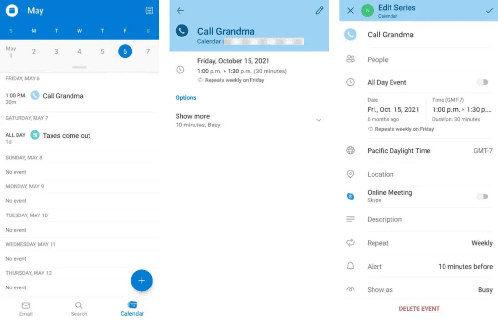
Both apps have free mobile versions for Android and iOS. The apps are the same in terms of accessibility and include many of the same features as the desktop versions. Both apps also include home page widgets for quick access.
But the Tasks aspect is missing from the app version of Outlook. All items created in Tasks are copied to the calendar as events. You can view these calendar events in the Outlook app, but you cannot use progress reports or other branch-specific features.
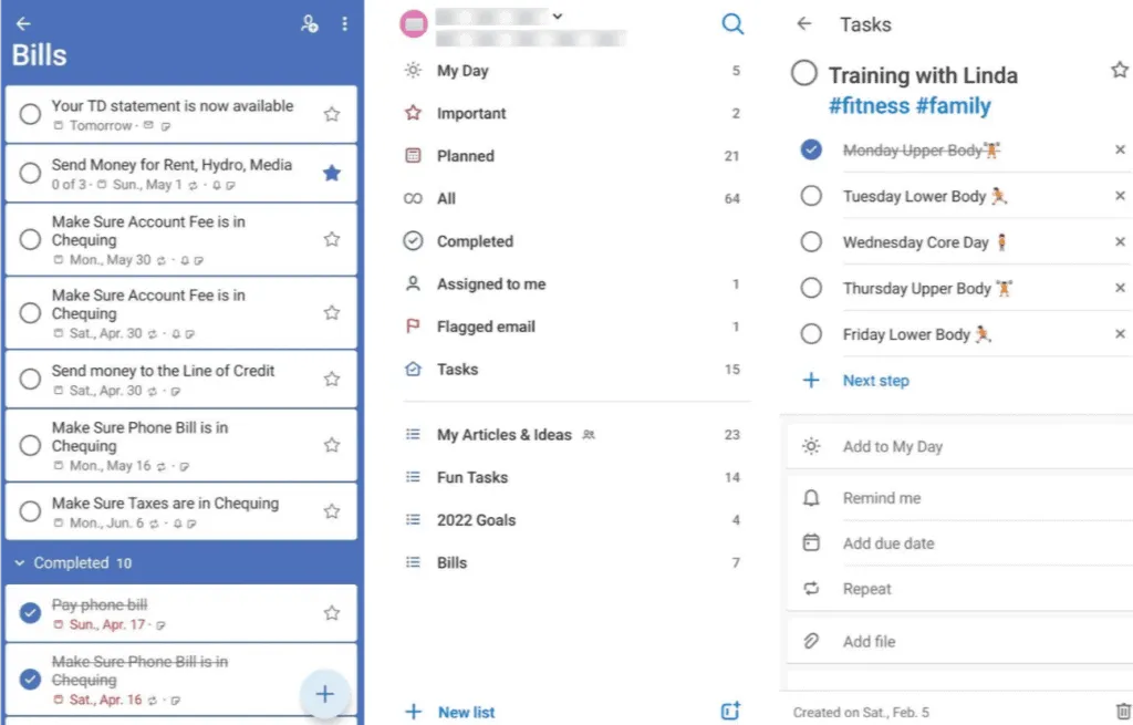
For ease of use, Outlook’s layout has many options and multi-layered menus. To Do is much easier to learn and manage. The streamlined design and simplified features are easy to navigate. It’s simple, even for a computer novice.
Winner: Microsoft To Do
Source: makeuseof
Want to know more?
Related
blogs
Tech Updates: Microsoft 365, Azure, Cybersecurity & AI – Weekly in Your Mailbox.
