
Knowledge base
July 09, 2021
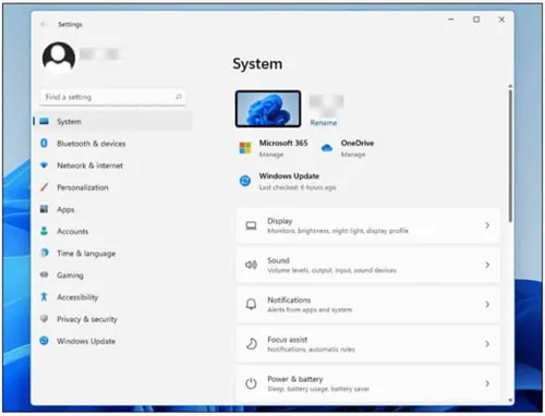
This is what the Windows 11 Settings app looks like
When launching the Settings app in Windows 11, it’s clear that Microsoft has gone to great lengths to streamline: it’s slimmer and easier to use than its Windows 10 counterpart. Here’s a quick tour of the new features of Settings in Windows 11.
Get to know Windows 11 settings
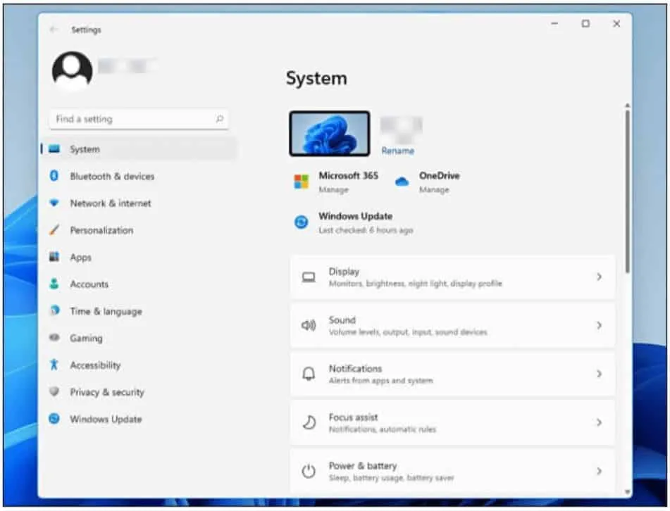
When you start Settings in Windows 11 (from the Quick Settings or Start menu, or by pressing Windows + i), you are greeted first with the system panel. The sleek, uncomplicated design makes finding a particular setting quite easy. Unlike the Windows 10 settings, there is no overview screen that shows all sections as a large menu of icons. Instead, a new sidebar has been substituted.
A new sidebar
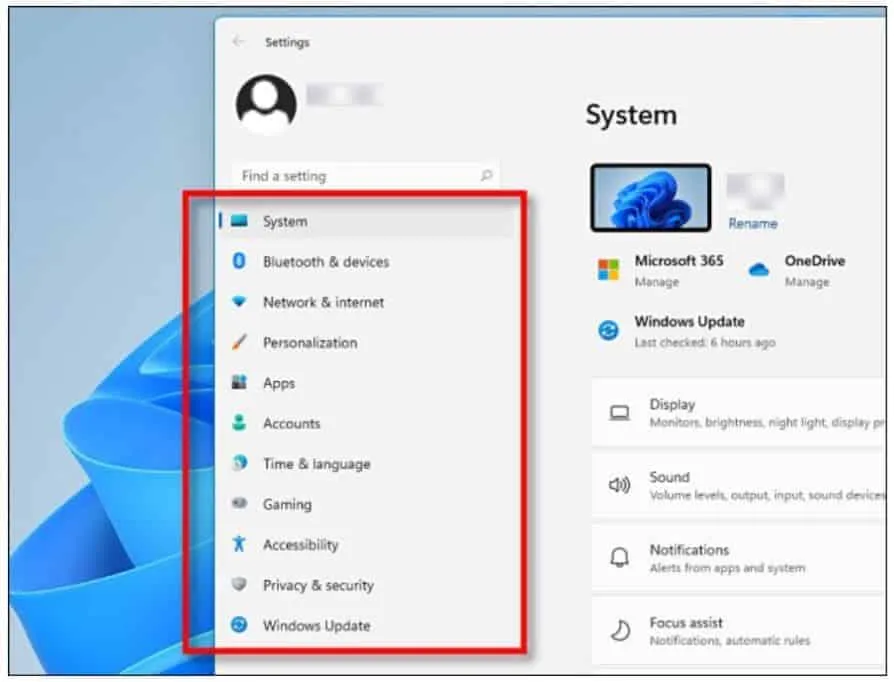
Windows 11 Settings presents the main configuration sections within the app as a new sidebar on the left side of the settings window. Once you click on one of the options in the sidebar, a new panel of options opens to the right of the window.
If you keep the Settings window large enough, the sidebar stays on the screen at all times. However, if you make the windows too small, the sidebar disappears to save space. It can be recalled with a special three-line menu button at the top of the window.
Submenu buttons
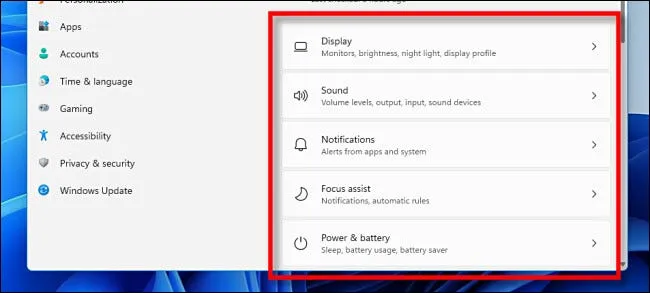
After clicking a sidebar option in Settings, you’ll see sub-options in the form of buttons. They are well organized, easy to see and thoughtfully laid out. Clicking this will take you in detail to change options.
Breadcrumbs for navigation
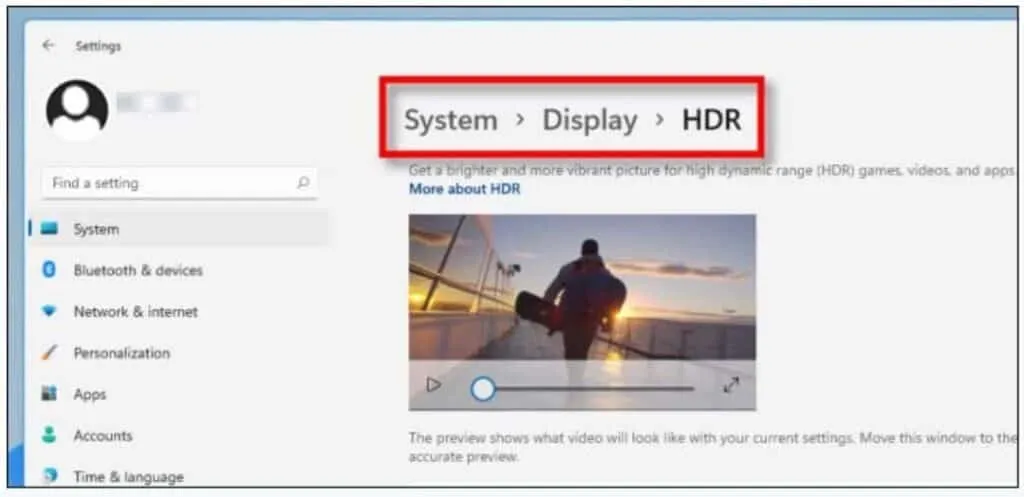
As you navigate through Settings, the app keeps track of where you are at all times with breadcrumbs at the top of the window. For example, we are located in System> View> HDR. To go back one level, click the arrow back in the upper left corner of the window or click “View” in the breadcrumbs.
Search
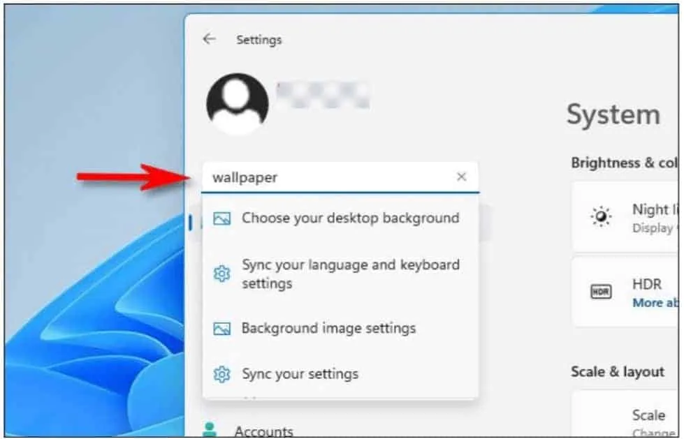
As long as the sidebar is visible, you can always access a search bar in Windows 11 Settings. After typing a term, you’ll see a small pop-up menu underneath with top suggestions. If there are too many results to fit into the small pop-up, you can see the full list in the right part of the window by clicking ‘Show all results’.
Account page
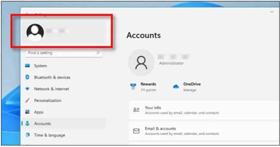
In Windows 11, there is one section, Accounts, that is not accessible through the normal sidebar list of sections. To change your account settings or manage accounts on your PC, click your account name in the upper-left corner of the window instead. This option remains in the sidebar at all times.
Windows Update
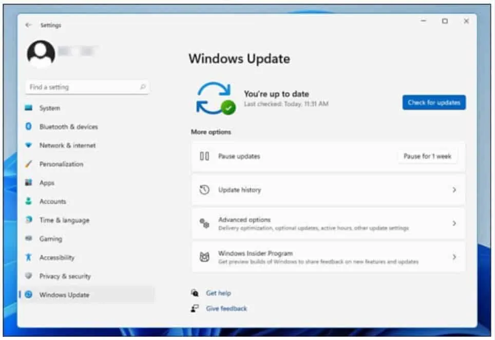
And for no particular reason, here is a look at the Windows Update section, which has a clean and clean interface. In general, the way Microsoft organized the elements in the Settings window makes visual sense and feels much less confusing and confused than Windows 10 settings.
And yes, the control panel is still one thing
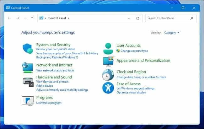
Despite rumors of its eventual demise, Control Panel is still present in the Windows 11 Preview release. It contains an almost identical layout to the Windows 10 Control Panel (with a few options changed here and there), but it uses new icons.
In the great Microsoft tradition, there is still a lot of legacy verve left in Windows 11, but it is clear that times are changing, and probably for the better.
Source: howtogeek
Want to know more?
Related
blogs
Tech Updates: Microsoft 365, Azure, Cybersecurity & AI – Weekly in Your Mailbox.


